A graphic is a figurative visual representation that describes concepts and relationships. Statistical graphs capture conceptual or numerical data and show the relationship that these data have with each other. There are multiple types of graphics depending on the type of information that you want to dump. For instance: bar charts, pie charts, scatter charts.
Graphics are a fundamental tool in statistics. They condense a large amount of information in a small space, which facilitates the reading and assimilation of the data in a faster and simpler way. They can transmit administrative, demographic, scientific, technological information. For instance: the results of elections of national or provincial authorities, the sales of a company, the data of a population census.
Chart types
There are different types of graphs, the choice of the type of graph to use will depend on the type of data available (qualitative or quantitative) and the amount of information.
- Cartesian graph. It is the basic chart scheme. It is called Cartesian in honor of René Descartes, French philosopher and mathematician. These graphs relate independent variables on the X axis (abscissa) to dependent variables on the Y axis (ordinate) on a system of orthogonal axes that intersect at an origin point. For instance: bar, line, or scatter charts.
- Graphics in geometric figures. They are graphics that are carried out in different geometric figures. For instance: pie or pie chart, bubble chart, or spider charts.
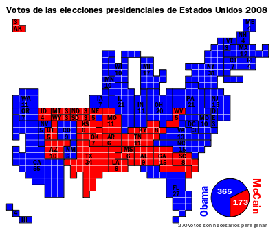
- Cartograms. They are statistical graphics that capture the information on maps.
Other charts are more complex, including, for example, two Y-axis systems, error bars, three-dimensional representations, accumulated data.
Statistical graph examples
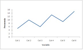
- Line graph
The line graph is used to show how a variable changes with the passage of time. In this type of graph, a set of points is connected by means of straight lines that, between all of them, manage to show the more or less regular dynamics of the behavior of something in relation to another variable. For example, it can be used to show how the average temperature of a city has changed over the last five years.
To make a line graph on paper, the two axes must be drawn naming them with the variable they represent. For example: X: months of the year; Y: temperature. Then enter the range and scale of each variable. Mark each piece of information with a point and connect the points with a line.
- Bar graphic
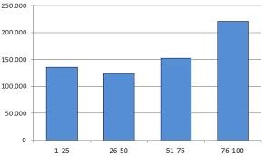
In bar or column charts, each value of the X axis corresponds to a value of Axis y A that determines the height of a column. They are very valuable for comparing magnitudes. For example, the number of inhabitants of a city can be represented according to the age range.
To make a line graph, the two axes must be drawn naming them with the variable they represent. For example: X: age range; Y: number of inhabitants. Then enter the rank and scale of each variable and draw the bars joining the information of both variables.
- Pie chart
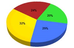
Also called pie chart, shows the distribution of a given total in different parts. It is a valuable tool for cases in which the absolute is known, and what is important is to know the way in which it was divided into several parts. For example, the percentage of votes obtained by each political party in an election can be represented.
To make a pie chart you must draw a circle with a compass. Draw the circle radius and with a protractor calculate the following data. Color each portion of the cake with a color.
- Scatter plot
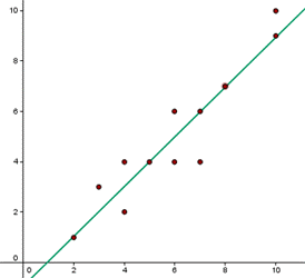
It is used only in cases of ordered pairs, with the intention of knowing the type of relationship established between the variables. All the relationships observed between the variable of one axis and that of the other are represented with points, and it is compared with a certain trend. Here, compared to a linear trend. It can be used, for example, for quality control of a certain product.
- Stacked area chart
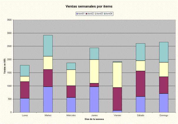
It is used in cases where you want to simultaneously cover the classic function of column charts (compare total magnitudes) and pie charts (show the distribution for a known total). Simultaneously the two things are done, showing the distribution in a rectangle instead of in a circle.
This type of graph can be used, for example, to graph the sales weekly, monthly or yearly of a certain product.
- Fluctuation graph
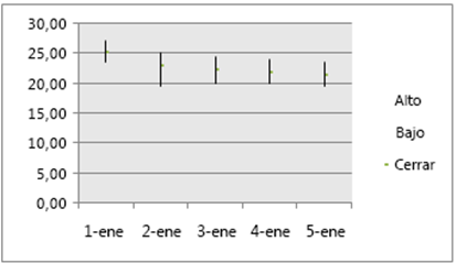
This type of chart is used to show magnitudes but also the changes that these have had, and their eventual exposure to modifications. The length of the line is what describes that fluctuation.
The fluctuation graph is used, to a greater extent, to graph fluctuations in the economic market.
- Spider graphic
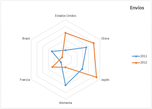
They are common for cases of analysis of results, where each variable has a maximum. A geometric figure is made with as many extremes as there are variables to be compared and the points of the known values are joined.
This type of graph can be used, for example in this case, to graph the number of shipments of products to other countries during 2011 and 2012 in France, Brazil, the United States, China, Japan and Germany.
- Clustered bar chart
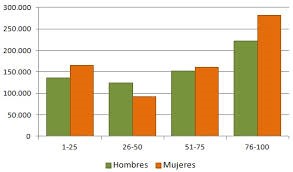
In the clustered bar chart you use a single bar chart to express several at once. For each value of “x” there are several values of “y”. It must be done in an organized way with different colors, and it must be taken into account that here the total is not usually perceived correctly by adding the categories, which is the case with stacked areas.
This type of graph can be used to graph, for example in this case, the number of women and men divided into age range in a certain territory. This graph allows us to measure two variables at the same time (men and women).
- Pyramid chart
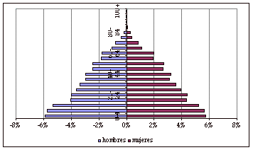
The pyramid chart allows you to simultaneously display the frequency of a certain variable in women and men (for example, age). As you go up, the frequency decreases and the graph takes the shape of a pyramid.
It is used frequently to dump population census results.
- Frequency polygon
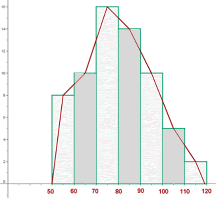
Lets describe a global trend by joining the midpoints of the frequencies of each interval on a bar graph (class marks).
They are made from a frequency histogram (vertical columns). They are more common in the human and social sciences than in the natural and exact sciences.
- Cartograms
They are graphics that are made on maps. Different types of marks or references are applied that show results around a certain situation or event.
For example: vote of presidential elections by region or district.
